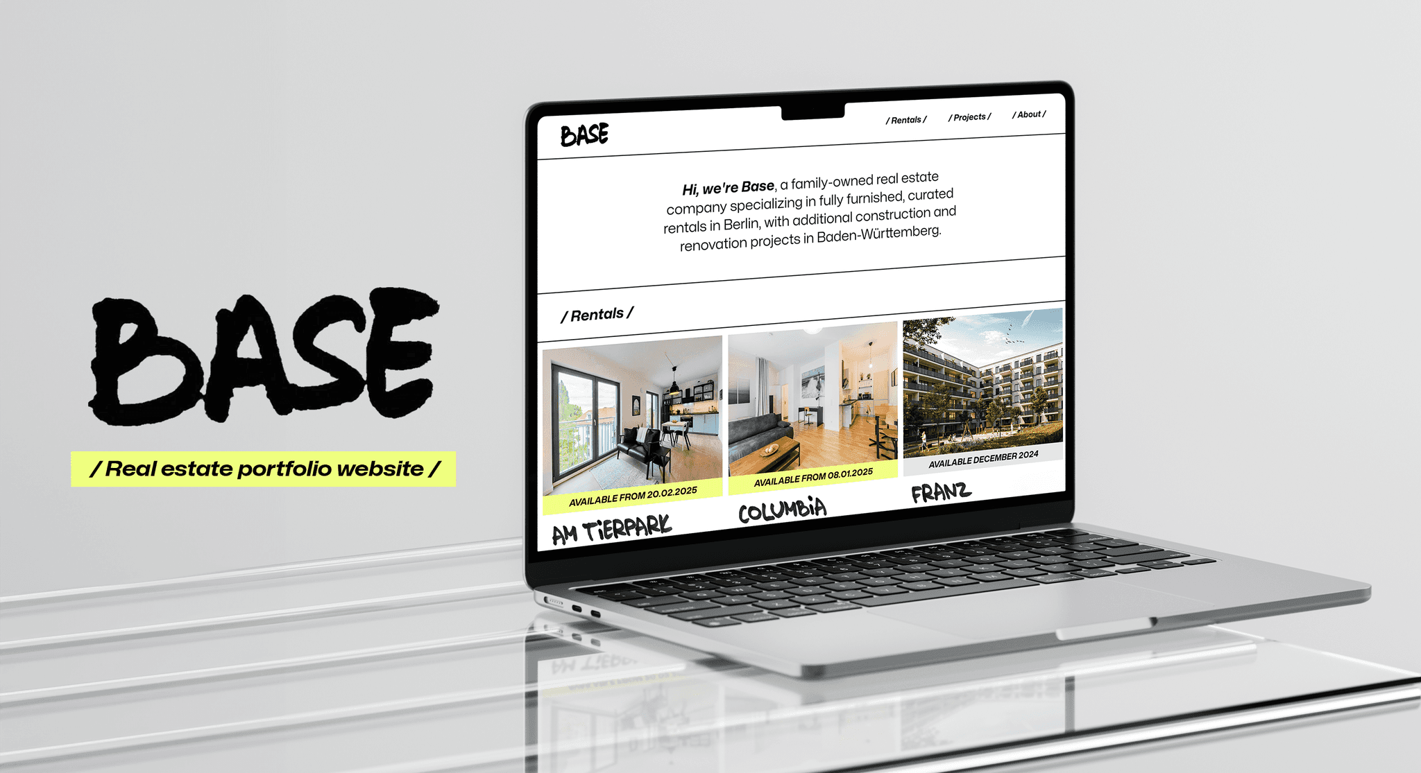
BASE: A Home For Our
Real Estate Projects
BASE:
A Home For Our Real Estate Projects
Base Quarters | UI Design
Base Quarters | UI Design
overview
overview
Base is our family-run, growing real estate portfolio. We focus on beautifully furnished mid-term rental apartments for expats in Berlin, along with renovation and construction projects in Baden-Württemberg.
As our network and conversations expanded, we needed a simple but interesting way to show everything we’re working on, something that could live online and speak for itself.
That’s where the idea for this project was born: create a digital home that reflects the care we put into our physical ones.
project Type
project Type
Desktop Design;
Branding
Desktop Design;
Branding
MY ROLE
MY ROLE
UI Design
(Research, Ideation, Prototyping, Visual Identity & Design, Responsive Layout, Building in Framer)
UI Design
(Research, Ideation, Prototyping, Visual Identity & Design, Responsive Layout, Building in Framer)
INDUSTRY
INDUSTRY
Real Estate
Real Estate
DURATION
DURATION
2 weeks
2 weeks
Problem
Problem
There is no central, professional space to showcase our properties and projects.
There is no central, professional space to showcase our properties and projects.
Business Goal
Business Goal
Design a visually distinct and story-driven platform to present our portfolio and build credibility with potential partners, and collaborators.
Create an easy-to-use, visually appealing digital platform to present
our real estate portfolio to potential partners and investors.
Solution
Solution
Create a clean, character-rich website that makes exploring our real estate work easy, engaging, and memorable.
Create a clean, character-rich website that makes exploring our real estate work easy, engaging, and memorable.
Discovery
Discovery
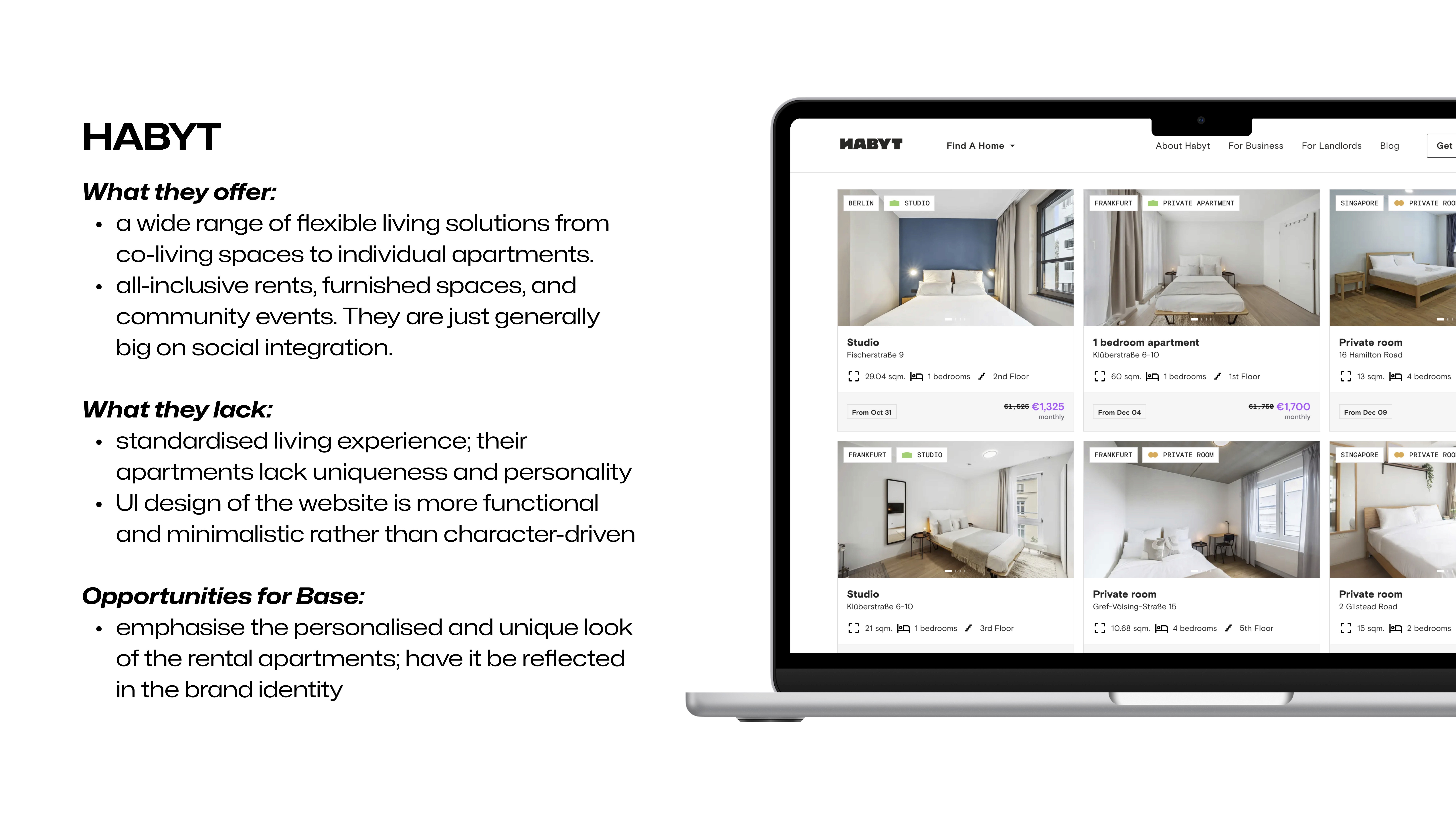
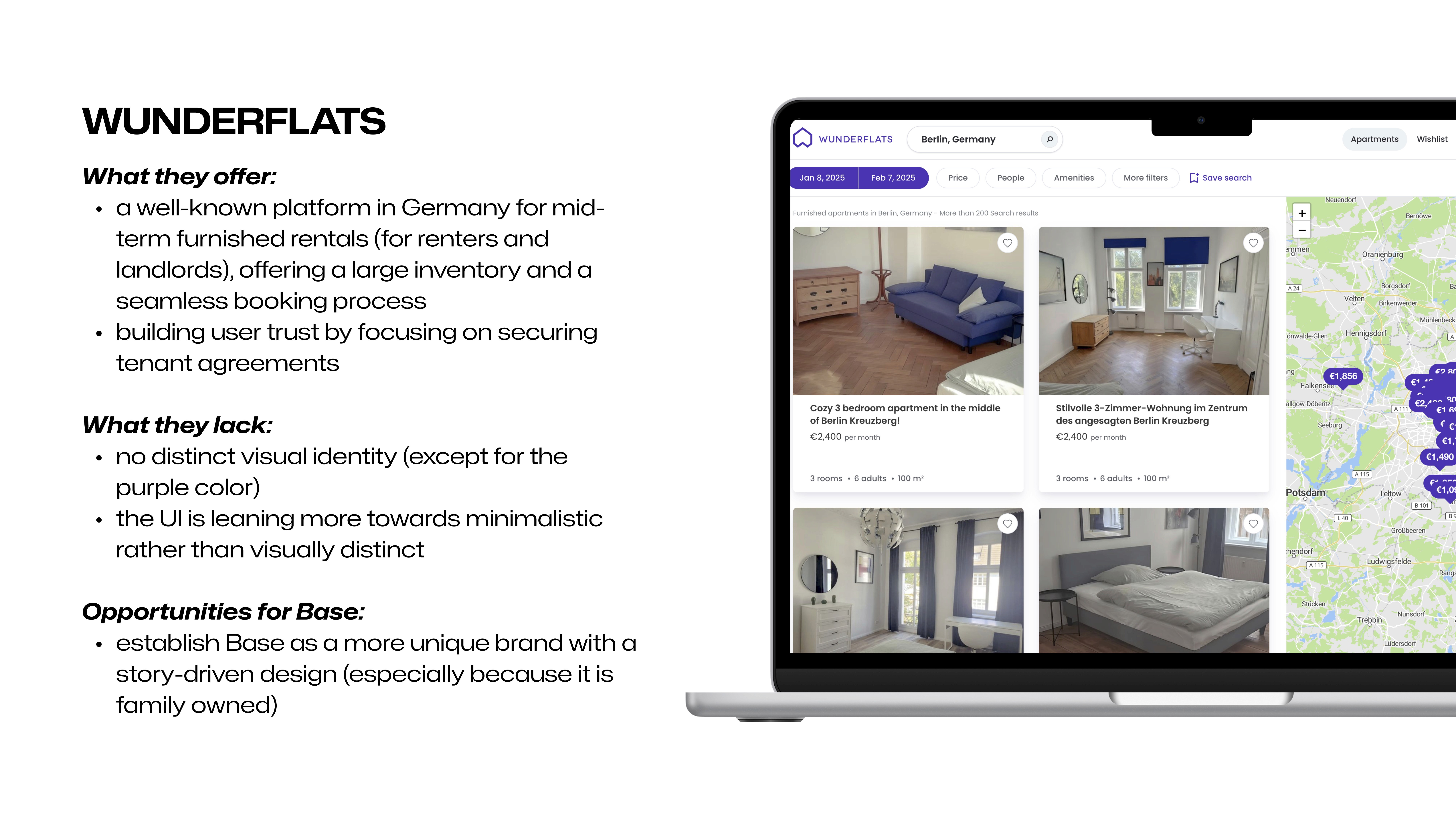
Competitor Analysis
Competitor Analysis
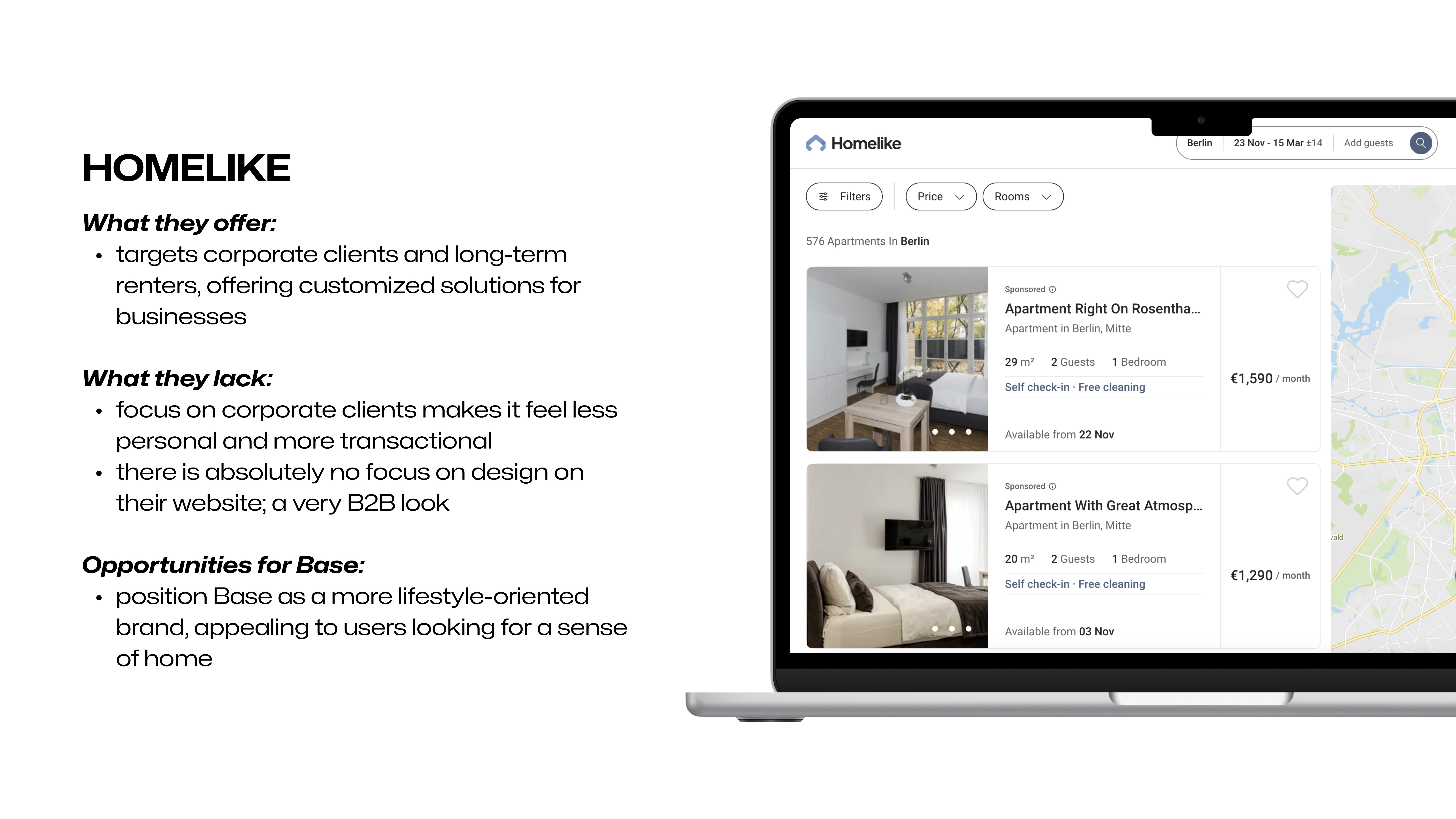
Established platforms like Wunderflats, Homelike, and Habyt are functional, but visually bland. I saw this as our chance to shine: by bringing a fresh, and alternative vibe into Base’s design, we could tell a more personal, engaging story and connect with people looking for a temporary home.
Established platforms like Wunderflats, Homelike, and Habyt offer reliability, flexibility, and an extensive listings choice, but honestly, they feel pretty bland and corporate. I saw this as our chance to shine: by bringing a fresh, and alternative vibe into Base’s design, we could tell a more personal, engaging story and connect with people looking for a home.
Established platforms like Wunderflats, Homelike, and Habyt are functional, but visually bland. I saw this as our chance to shine: by bringing a fresh, and alternative vibe into Base’s design, we could tell a more personal, engaging story and connect with people looking for a temporary home.
ideation
ideation
Vision
Vision
Our users are often partners, potential investors, or curious peers in real estate. I designed with the assumption that they want to quickly understand who we are, what we offer, and where we’re headed, without digging through a dense site. This led to a content-light, visual-first approach.
Our users are often partners, potential investors, or curious peers in real estate. I designed with the assumption that they want to quickly understand who we are, what we offer, and where we’re headed, without digging through a dense site. This led to a content-light, visual-first approach.
Sketches
Sketches
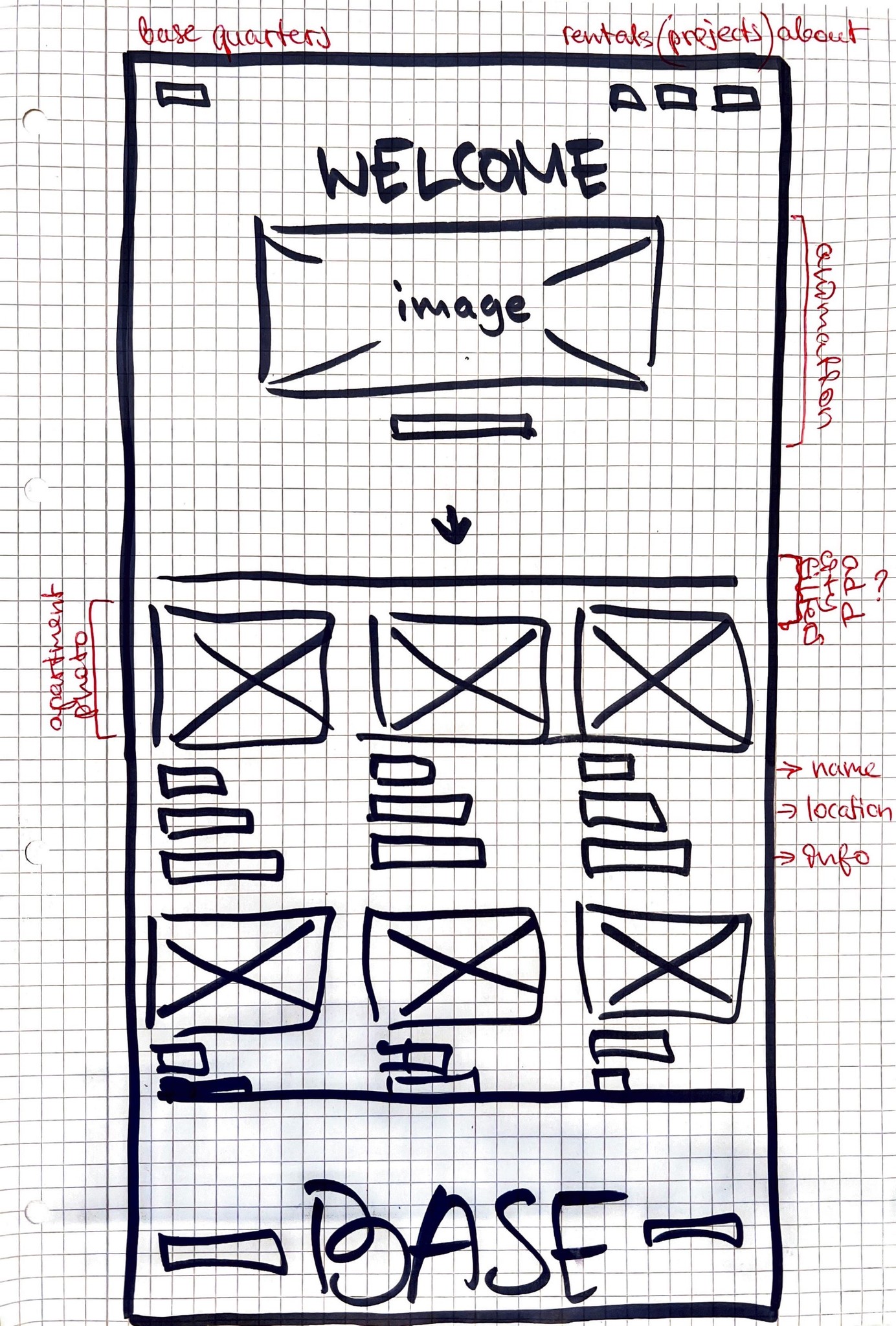
In the early sketches I focused on big visuals, short project descriptions, and avoided typical corporate layouts.
In the early sketches I focused on big visuals, short project descriptions, and avoided typical corporate layouts.
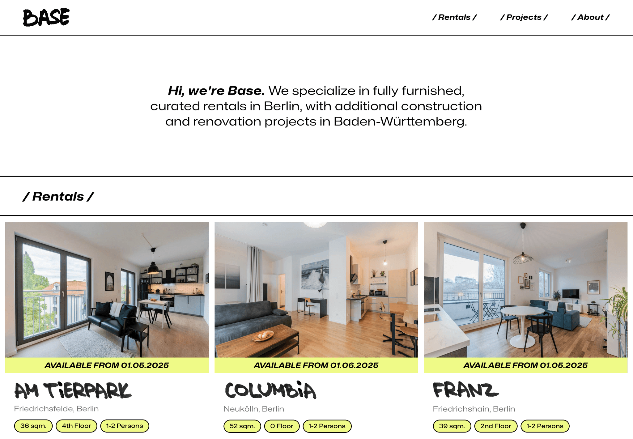
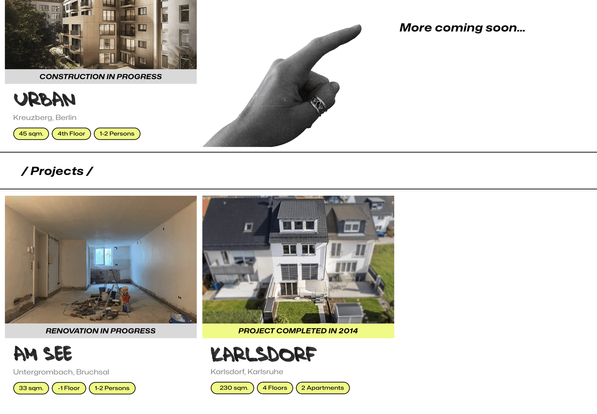
It was important for us to present our mid-term rentals first, since it's the biggest part of our business, and something we talk a lot about.
It was important for us to present our mid-term rentals first, since it's the biggest part of our business, and something we talk a lot about.
It was important for us to present our mid-term rentals first, since it's the biggest part of our business, and something we talk a lot about.
Prototype
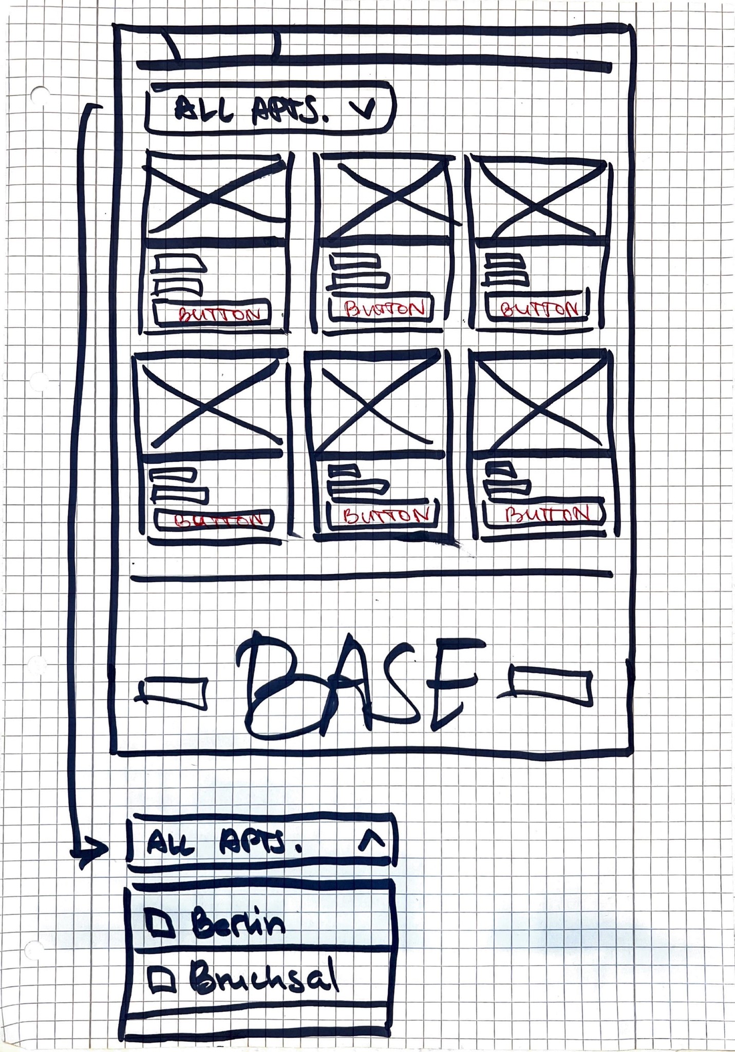
Mid-Fi Prototype Iterations
As I started digitalizing the sketches, I started playing with giving it a certain look, that is different from the clean look of real estate websites. It was important for me to make the website appear more approachable in comparison to the standard housing websites.
Prototype
Mid-Fi Prototype Iterations
As I started digitalizing the sketches, I started playing with giving it a certain look, that is different from the clean look of real estate websites. It was important for me to make the website appear more approachable in comparison to the standard housing websites.
Using Figma during this stage of the design process allowed me to digitally map out my design ideas, while starting the visual identity exploration.
Using Figma during this stage of the design process allowed me to digitally map out my design ideas, while starting the visual identity exploration.
Refining
Refining
The Visual Identity
Visual Identity
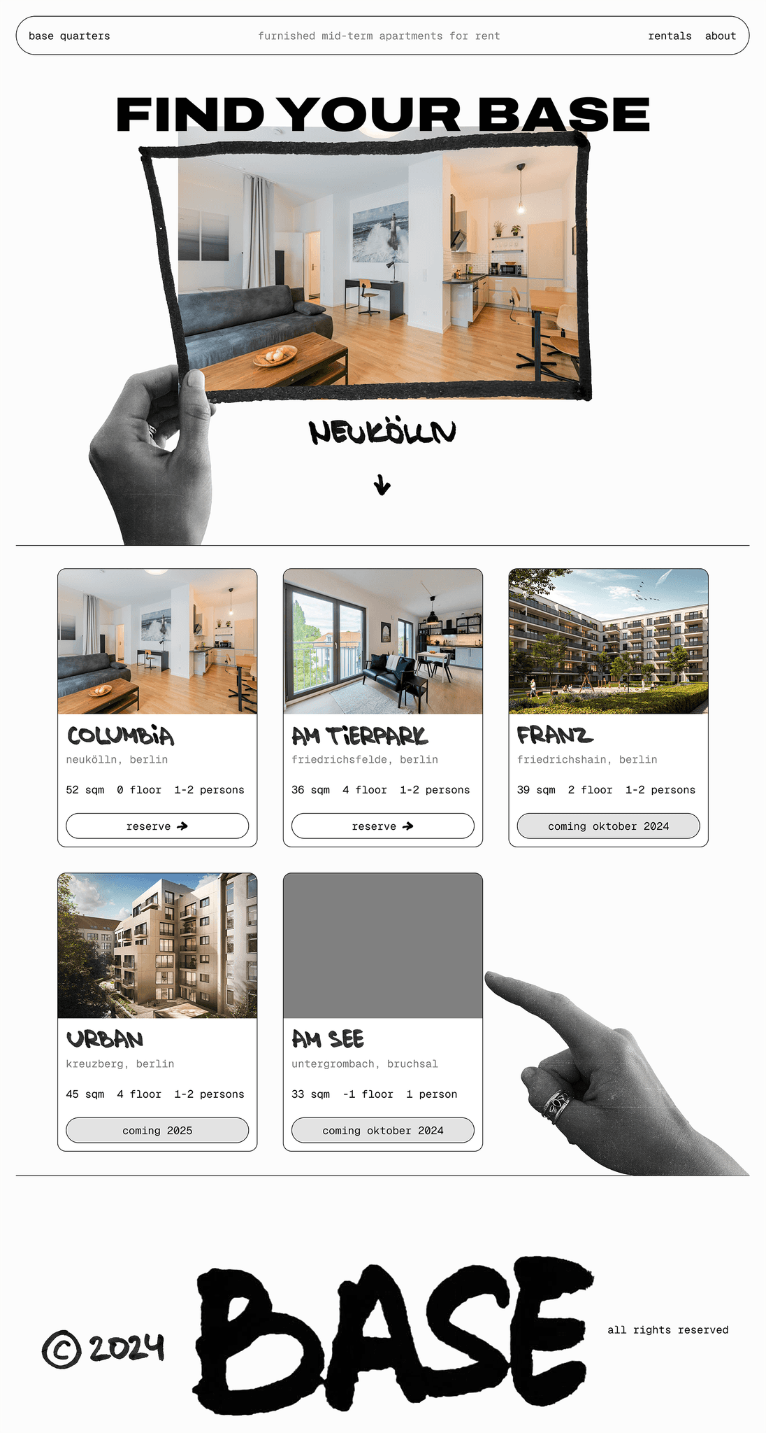
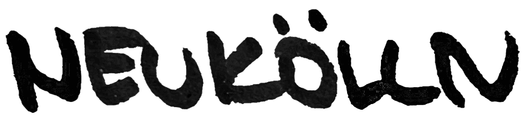
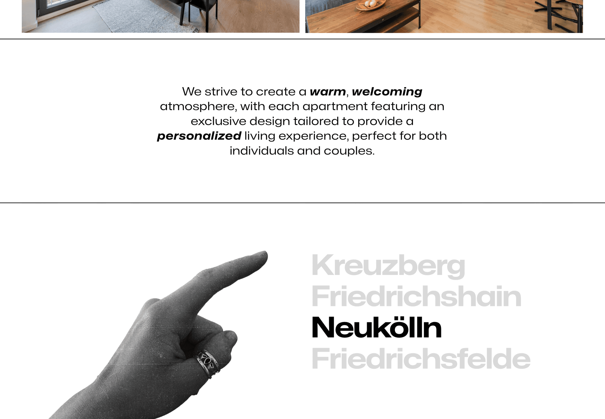
Being a family-owned business, I crafted a visual identity that truly reflects our unique character. Rooted in Berlin, with all rental properties located in some of the most sought-after neighborhoods like Kreuzberg, Neukölln, and Friedrichshain, it was essential to infuse the brand with the city’s iconic alternative vibe. The handwritten apartment names paired with wide typography create a striking balance between structure and chaos, capturing the essence of Berlin’s dynamic spirit.
Being a family-owned business, I crafted a visual identity that truly reflects our unique character. Rooted in Berlin, with all rental properties located in some of the most sought-after neighborhoods like Kreuzberg, Neukölln, and Friedrichshain, it was essential to infuse the brand with the city’s iconic alternative vibe. The handwritten apartment names paired with wide typography create a striking balance between structure and chaos, capturing the essence of Berlin’s dynamic spirit.
Logo
Logo
For the logo, I chose a bold, handwritten style to reflect Base's approachability, while capturing the brand's creative, personal, and down-to-earth identity.
For the logo, I chose a bold, handwritten style to reflect Base's approachability, while capturing the brand's creative, personal, down-to-earth identity.
For the logo, I chose a bold, handwritten style to reflect Base's approachability, while capturing the brand's creative, personal, and down-to-earth identity.

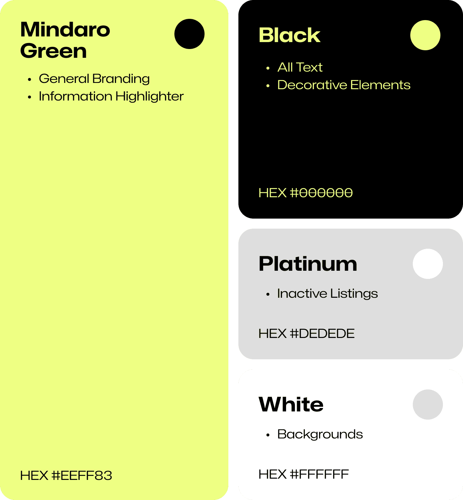
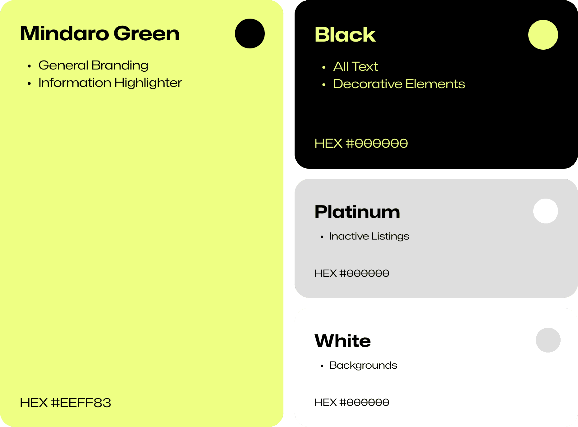
Color
Color
Simple & Minimalistic
Mindaro green is used as a pop of color in an otherwise very minimal color palette.
Simple & Minimalistic
Mindaro green is used as a pop of color in an otherwise very minimal color palette.
Simple & Minimalistic
Mindaro green is used as a pop of color in an otherwise minimal color palette.
Typography
Typography
Technical meets organic.
Staying true to Berlin’s alternative vibe, I mixed the clean, structured feel of Mona Sans with my own handwriting to bring in a more personal touch. The contrast adds a fun, laid-back energy while still keeping things fresh and modern.
Technical meets organic.
Staying true to Berlin’s alternative vibe, I mixed the clean, structured feel of Mona Sans with my own handwriting to bring in a more personal touch. The contrast adds a fun, laid-back energy while still keeping things fresh and modern.
Mona Sans
Expanded
Mona Sans
Expanded
Mona Sans
Expanded
Ag
Ag
Ag
Ag
Ag
Ag
Graphic Elements
Graphic Elements
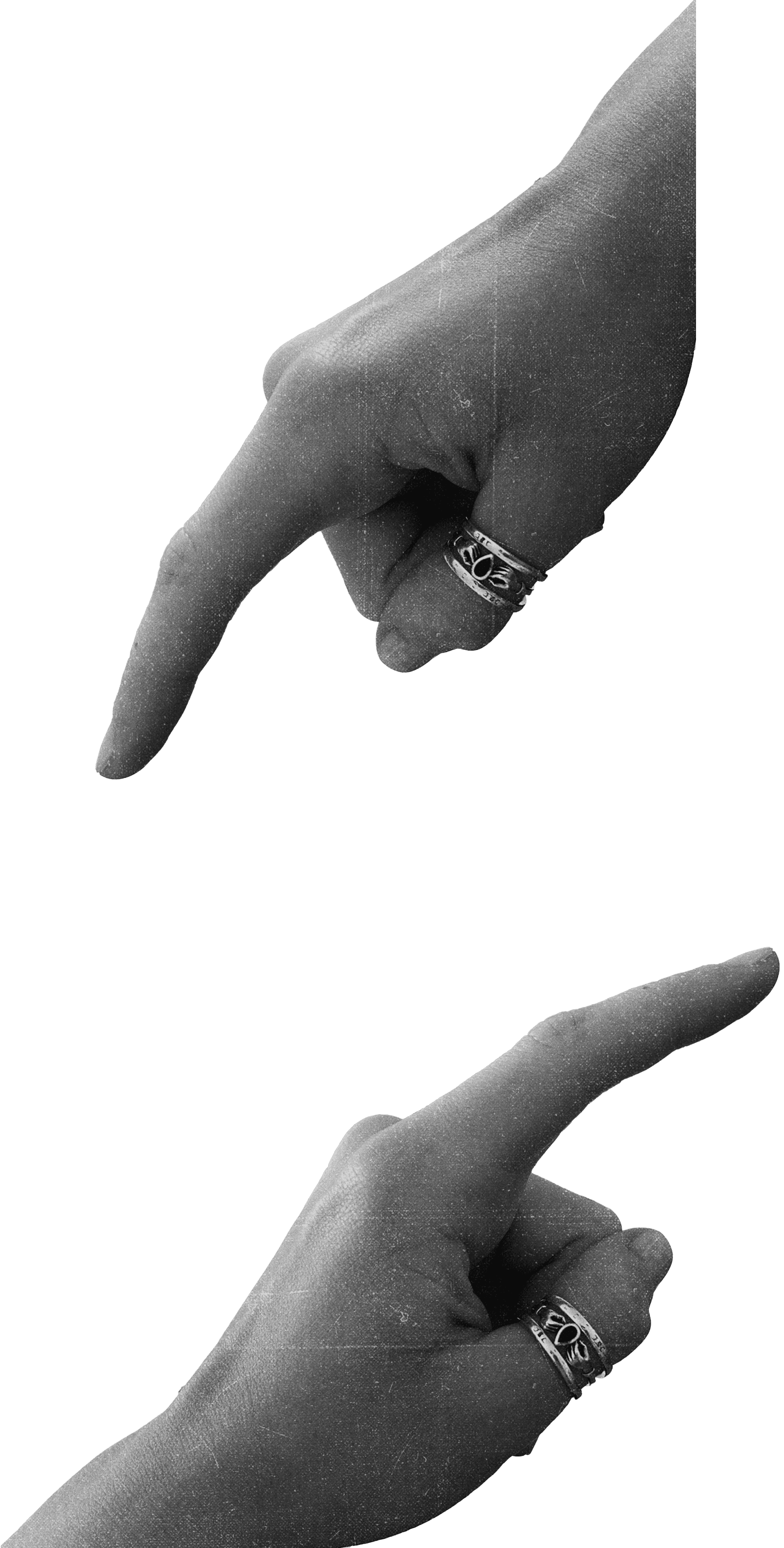
It's giving funky.
I am using a cutout of my hand as a fun little element :)
It's giving funky.
I am using a cutout of my hand as a fun little element :)
Finalize
Finalize
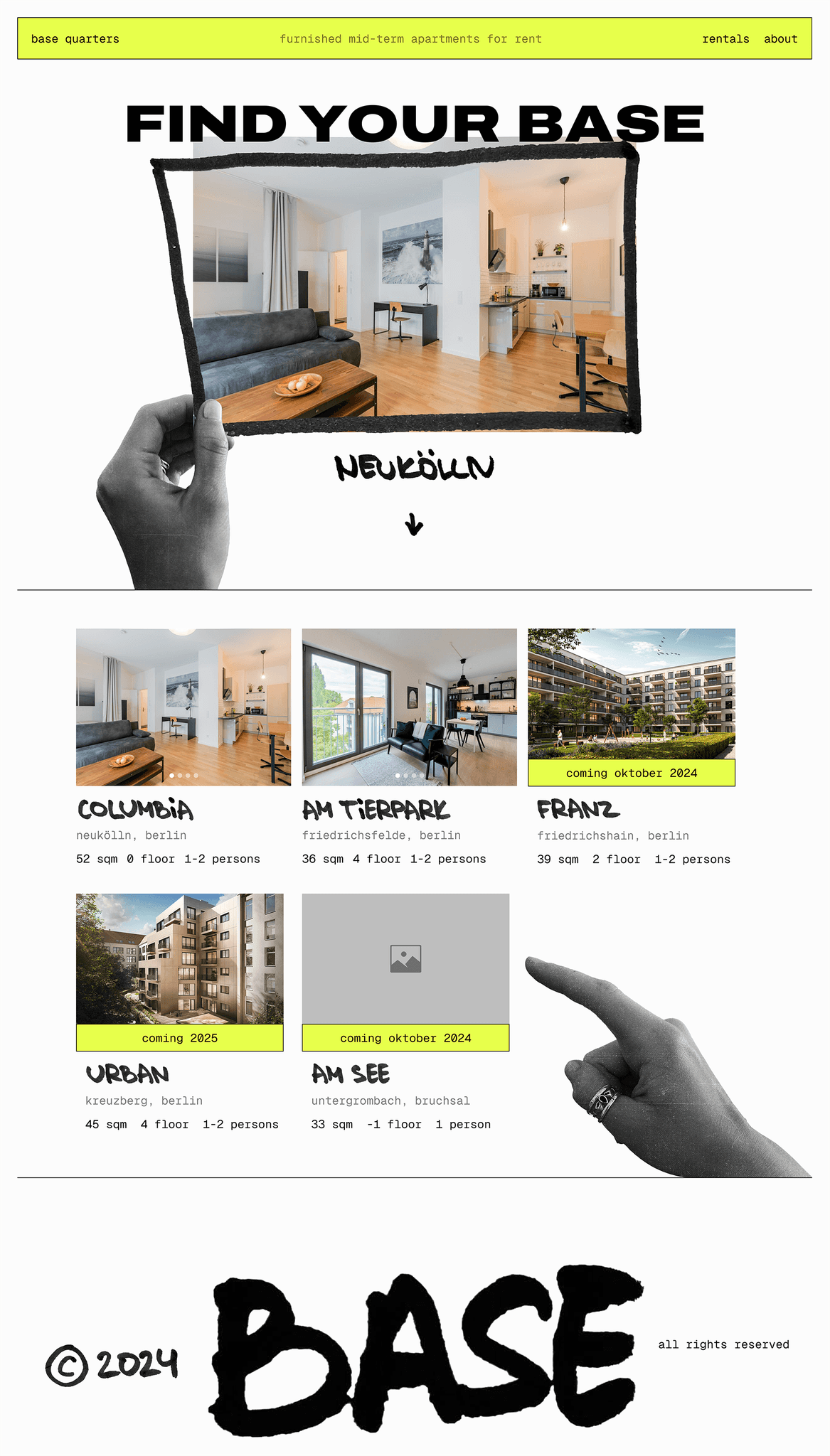
Final Design
Final Design
Limitations
Limitations
After outlining the design in Figma, I have moved to Framer and recreated everything from scratch. As I was transferring my designs, I ran into multiple issues that I wasn't able to resolve due to my lack in coding experience. So I adjusted my design accordingly.
After outlining the design in Figma, I have moved to Framer and recreated everything from scratch. As I was transferring my designs, I ran into multiple issues that I wasn't able to resolve due to my lack in coding experience. So I adjusted my design accordingly.
While it's looking different from the original, I've kept its playful essence.
While it's looking different from the original, I've kept its playful essence.
Demo
Demo
© 2025 Katya Beck. All Rights Reserved.
© 2025 Katya Beck. All Rights Reserved.